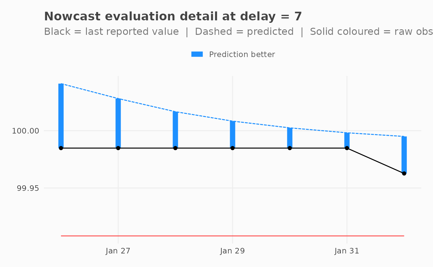
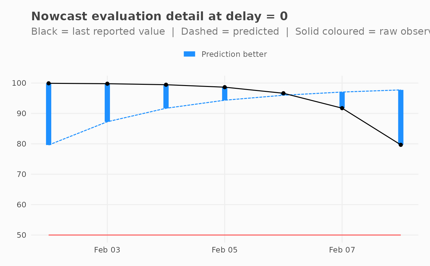
For a selected delay, plots predicted and observed values over time alongside the last reported value. Vertical segments show which estimate (raw observed or predicted) was closer to truth for each occurrence date.
Usage
plot_nowcast_eval_detail(
  x,
  delay = NULL,
  color_good = "dodgerblue1",
  color_bad = "firebrick1",
  ...
)
Arguments
- x
A
nowcast_eval_resultsS7 object fromnowcast_eval().- delay
Numeric. Which delay to plot. Defaults to the minimum delay in the data if missing.
- color_good
Character. Colour when prediction beats raw observed.`.
- color_bad
Character. Colour when raw observed beats prediction.`.
- ...
Ignored.
Examples
input <- generate_test_data()
eval_res <- nowcast_eval(
  df = input,
  col_date_occurrence = date_occurrence,
  col_date_reporting = date_report,
  col_value = value,
  n_past = 10,
  time_units = "days"
)
#> Warning: n_past (10) exceeds available reporting periods (8). Will be using the max available instead: 7
plot_nowcast_eval_detail(eval_res)

plot_nowcast_eval_detail(eval_res, delay = 7)