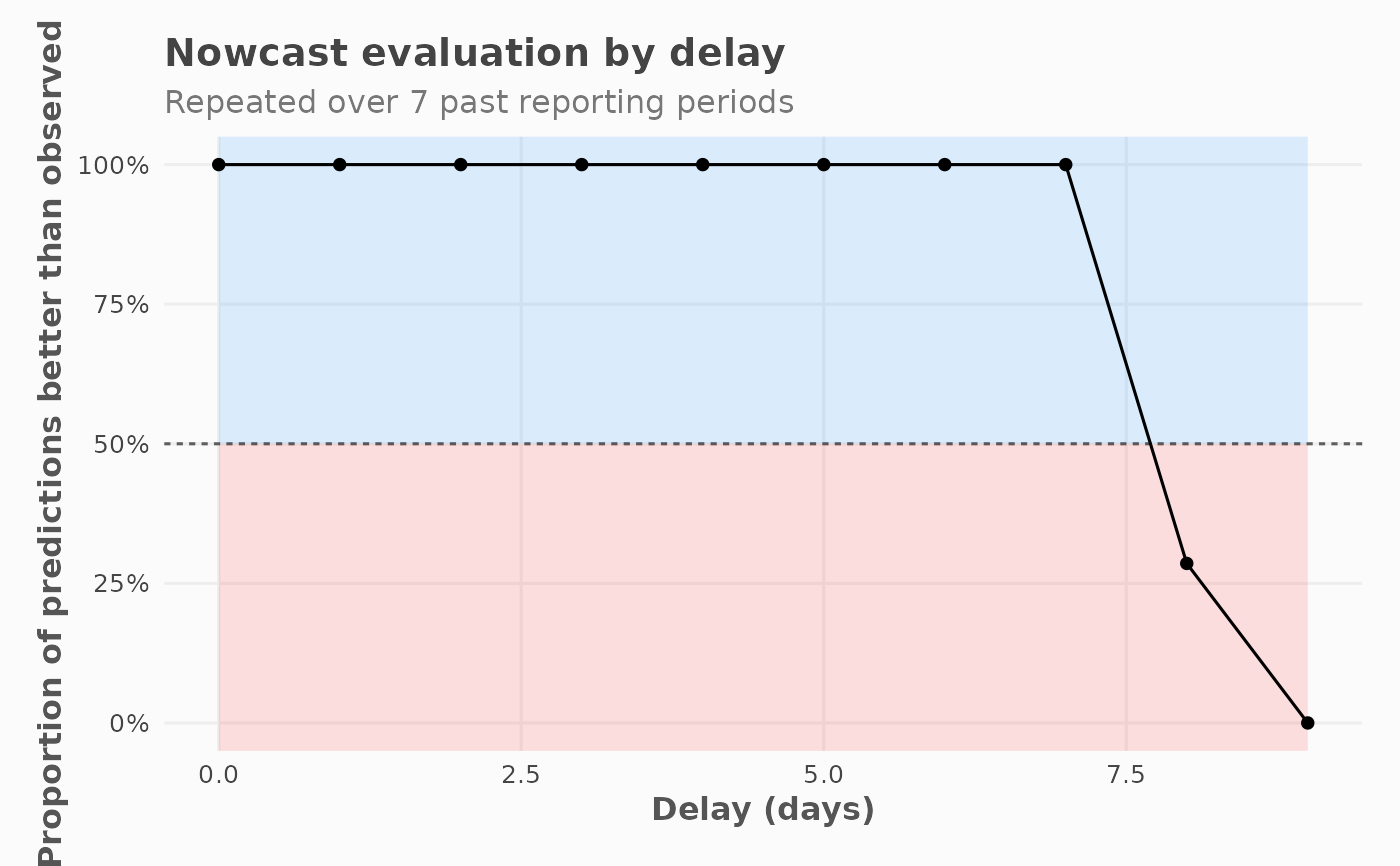
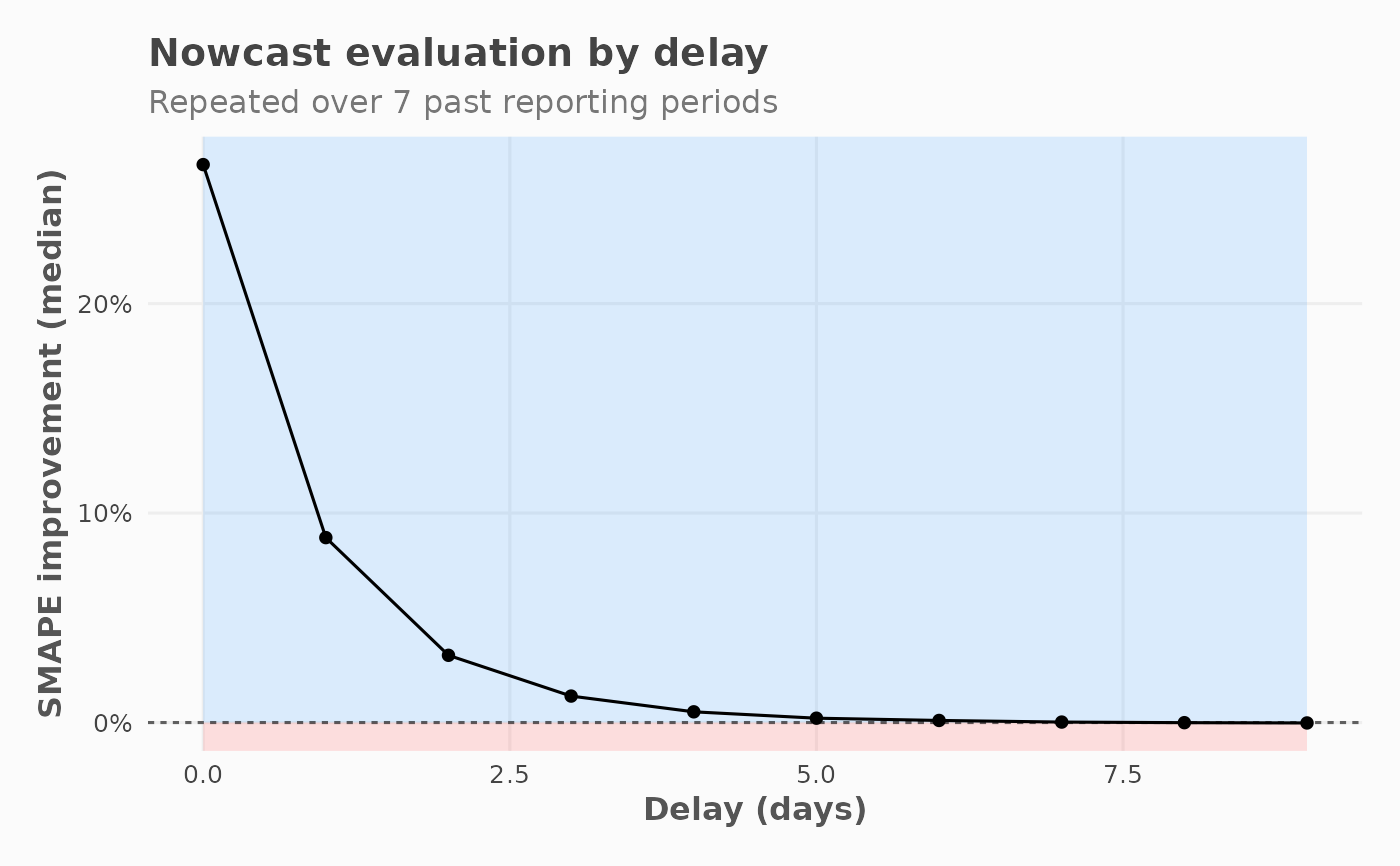
Plots evaluation metric as a function of delay, faceted by group. The y-axis shows how much the nowcast improves over raw observed values, across all delays. Background shading indicates the direction of improvement.
Usage
plot_nowcast_eval_by_delay(
  x,
  indicator = "smape_diff_med",
  color_good = "dodgerblue1",
  color_bad = "firebrick1",
  ...
)
Arguments
- x
A
nowcast_eval_resultsS7 object fromnowcast_eval().- indicator
Character. Which metric to plot on the y-axis. One of:
"smape_diff_med", or"winrate".- color_good
Character. Fill colour for the "better" region.`.
- color_bad
Character. Fill colour for the "worse" region.`.
- ...
Ignored.
Examples
input <- generate_test_data()
eval_res <- nowcast_eval(
  df = input,
  col_date_occurrence = date_occurrence,
  col_date_reporting = date_report,
  col_value = value,
  n_past = 10,
  time_units = "days"
)
#> Warning: n_past (10) exceeds available reporting periods (8). Will be using the max available instead: 7
plot_nowcast_eval_by_delay(eval_res)

plot_nowcast_eval_by_delay(eval_res, indicator = "winrate")