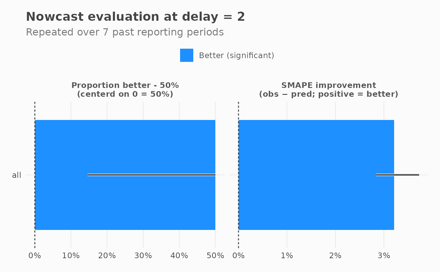
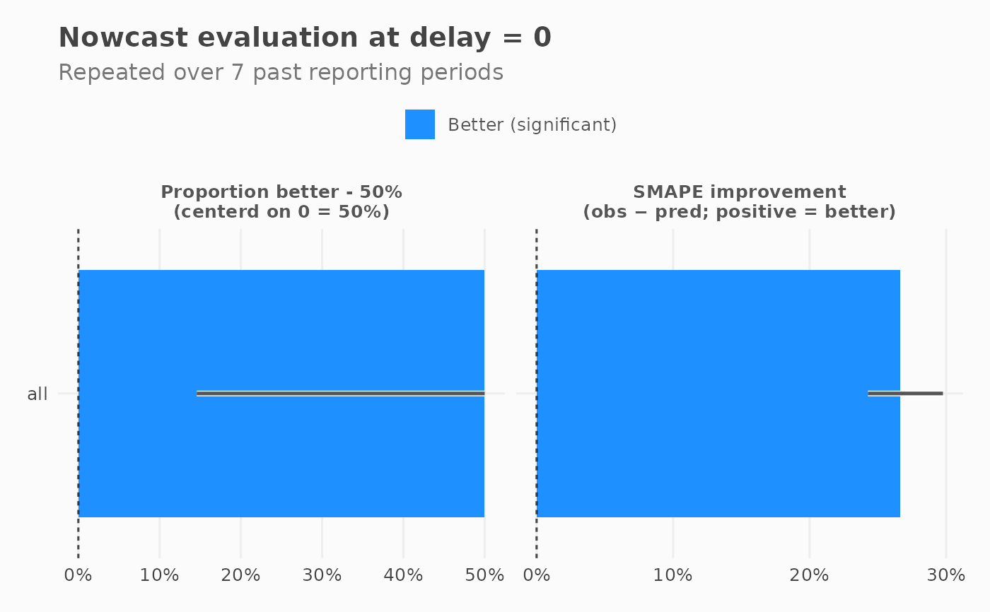
Plots a horizontal bar chart of nowcasting evaluation metrics per group, at a selected delay. Two panels are shown side by side:
Differential SMAPE: median per-prediction SMAPE difference (obs minus pred; positive = prediction is better), with IQR as error bar.
winrate: share of past periods where prediction beat raw observed, centered at 0 (0.5 = no improvement), with Wilson 95% CI.
Bars are coloured by whether the improvement is significant (IQR / CI fully above or below zero) or not.
Usage
plot_nowcast_eval(
  x,
  delay = NULL,
  color_good = "dodgerblue1",
  color_bad = "firebrick1",
  alpha_less = 0.35,
  ...
)
Arguments
- x
A
nowcast_eval_resultsS7 object fromnowcast_eval().- delay
Numeric. Which delay to plot. Defaults to the minimum delay in the data if missing.
- color_good
Character. Colour for significantly better predictions.`.
- color_bad
Character. Colour for significantly worse predictions.`.
- alpha_less
alpha value for the "less significant" bars, 0-1.
- ...
Ignored.
Examples
input <- generate_test_data()
eval_res <- nowcast_eval(
  df = input,
  col_date_occurrence = date_occurrence,
  col_date_reporting = date_report,
  col_value = value,
  n_past = 10,
  time_units = "days"
)
#> Warning: n_past (10) exceeds available reporting periods (8). Will be using the max available instead: 7
plot(eval_res)

plot(eval_res, delay = 2)